At Azimo, I had the opportunity to lead the mobile payment experience as well as contribute to brand and visual design projects.
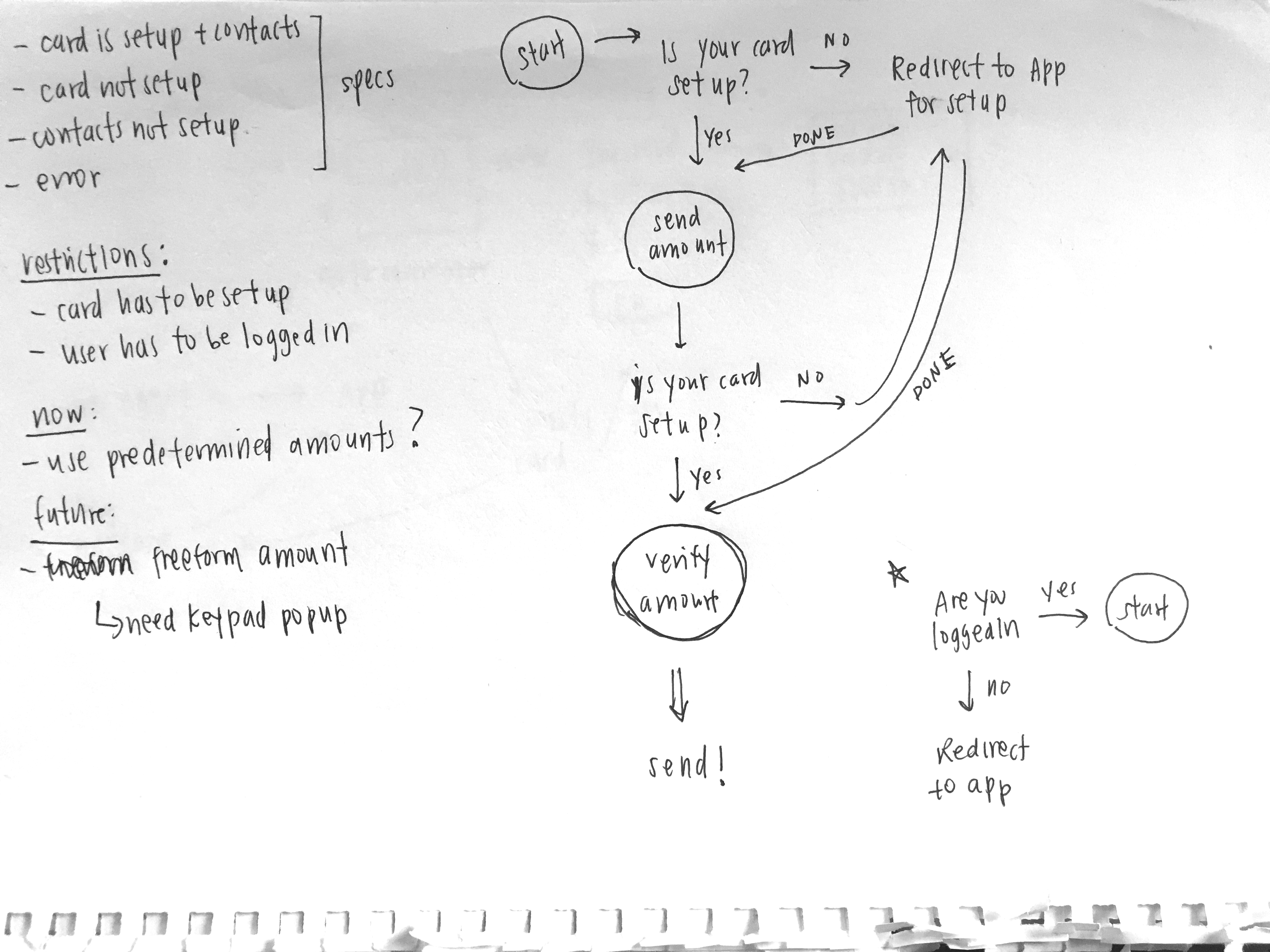
Some assumptions and technical restrictions we came into this project with include: 1) the user had to be logged in/already a member of Azimo 2) the user had to have a card set up 3) we would provide the user with choices of amounts to select (at least for the MVP).
The goals of using an app through iMessage, I determined was the 1) ease of completing a simple sharing action to a specific individual and 2) the ability to promote the app to a nonuser as they link will ultimately redirect them to the app (which then they had to download to see or complete the payment).
Since, iMessage does not support actual payment and is still very much a conversation platform. This meant designing payment into natural dialogue rather than a strict business transaction.
I sketched out a quick flow chart of possible app interactions for different states of users. I established there were multiple branches that could happen such as logged in user (vs no logged in), user who was logged in and had a card set up (or user who didn’t have card set up).
From left to right:
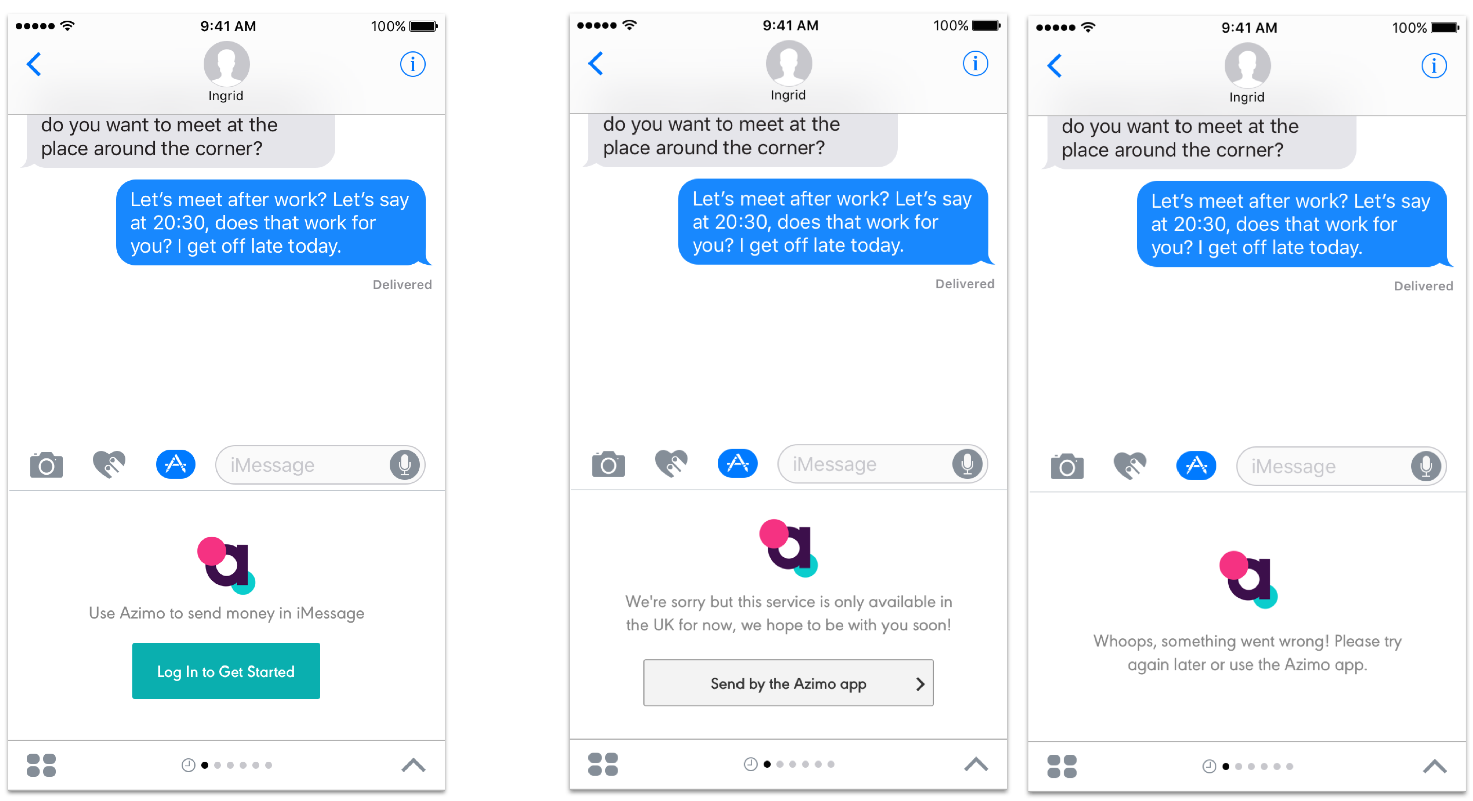
1 - Since iMessage apps would usually only show up if you have the companion app downloaded, the assumption was that the user already had an account so I could forgo the whole sign-up flow.
2 - If something doesn’t work via iMessage, the screen could always redirect the user to the app itself which would work all the time and satisfy the user’s request. Thus, error messages were crucial but they were more of a redirect page rather than an dead end error state.
3 - Here are two explorations of the error page. The user can either redirect themselves to the app via a button or they can just close iMessage and click on the app to try again. The left screen allows a smoother flow without the user doing all the work. However, the one on the right can be used in cases in which the app is down completely and it is really the end state.
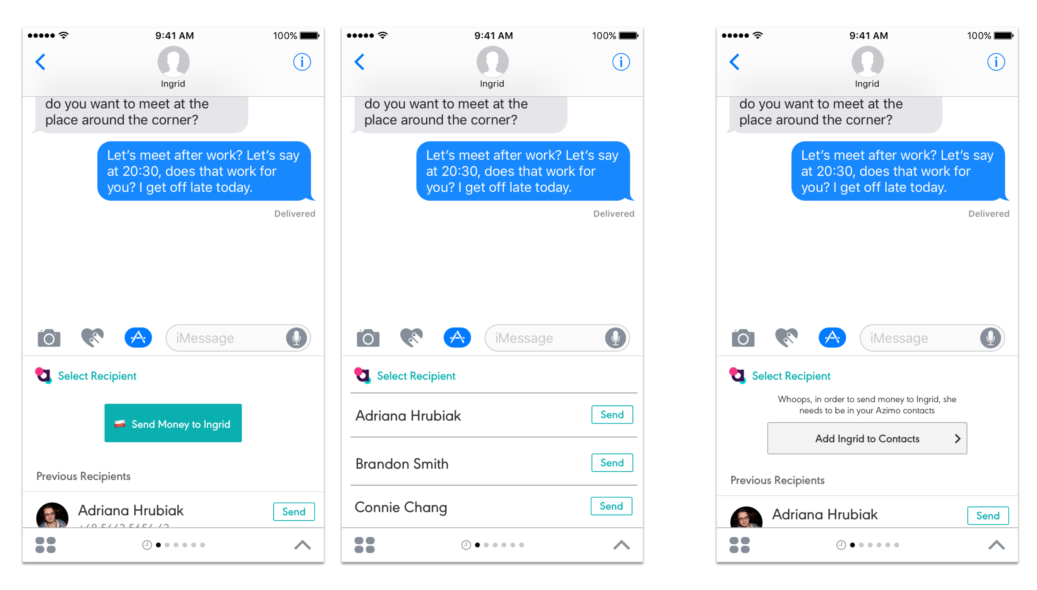
After the user is verified logged in, the next checkpoint was to see whether the contact the money was being sent to was already in the user’s contact list in the app. If it is, there are small details like the person’s country flag to show what kind of currency the person accepts. If not, there is an option to add to contact.
The middle screen displays how the contact list like how it is designed in the app itself. There was a need for the user to be able to also send money to someone else without leaving the conversation to do so.
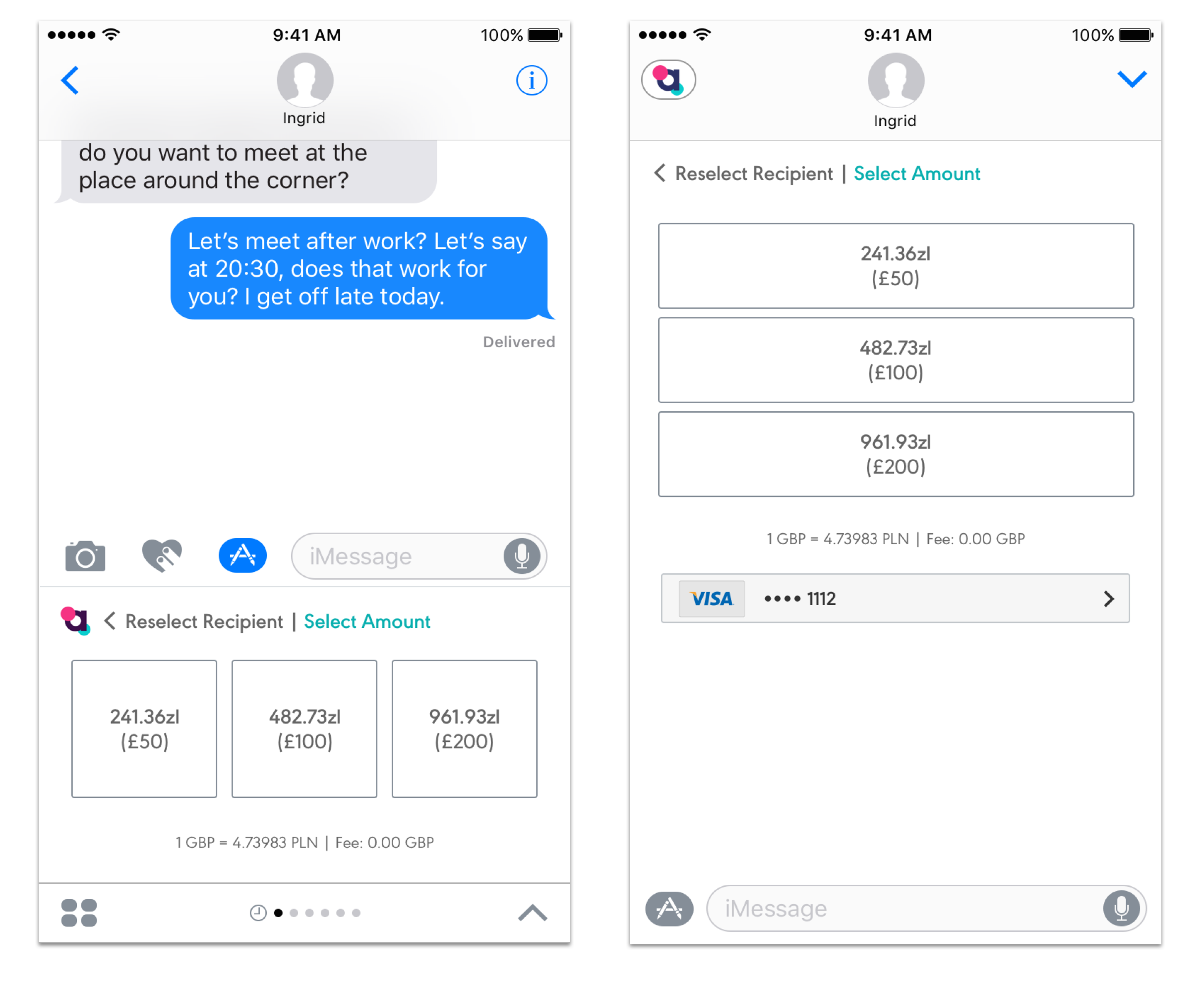
For the MVP, we decided on some predetermined amounts the user can send. In the future, the idea was to have the ability to freeform enter an amount.
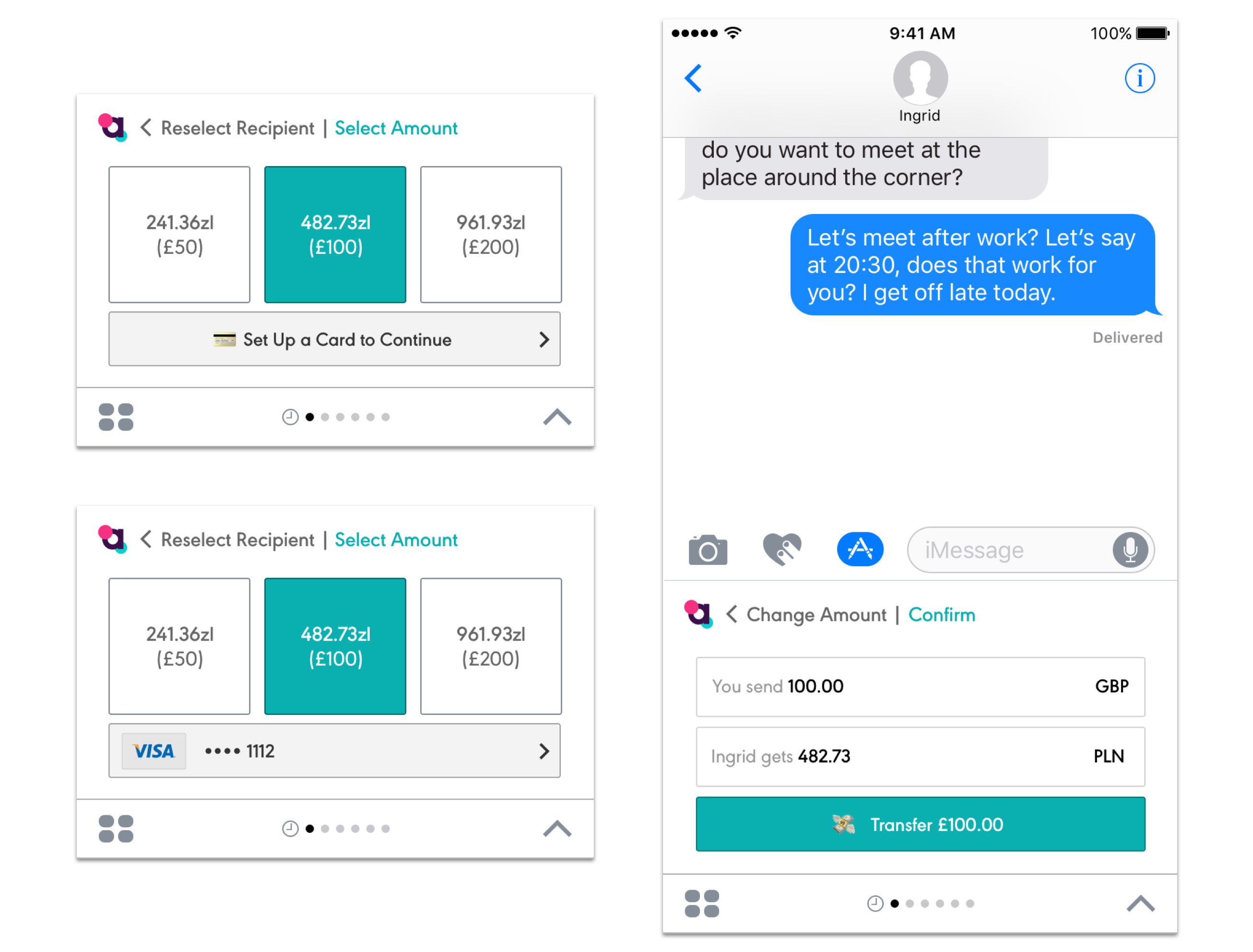
When the user clicks on an amount, the credit card option comes out. Here is the third and final checkpoint. If the card is already set up, the user can just proceed, otherwise, the button takes you to the app to set it up.
Something to change is to have a clearer ‘next’ button to proceed to the confirmation page. Right now, the credit card button doubles as a next button which is confusing because the color isn't the standard color for buttons and it looks like a call to action to change your card
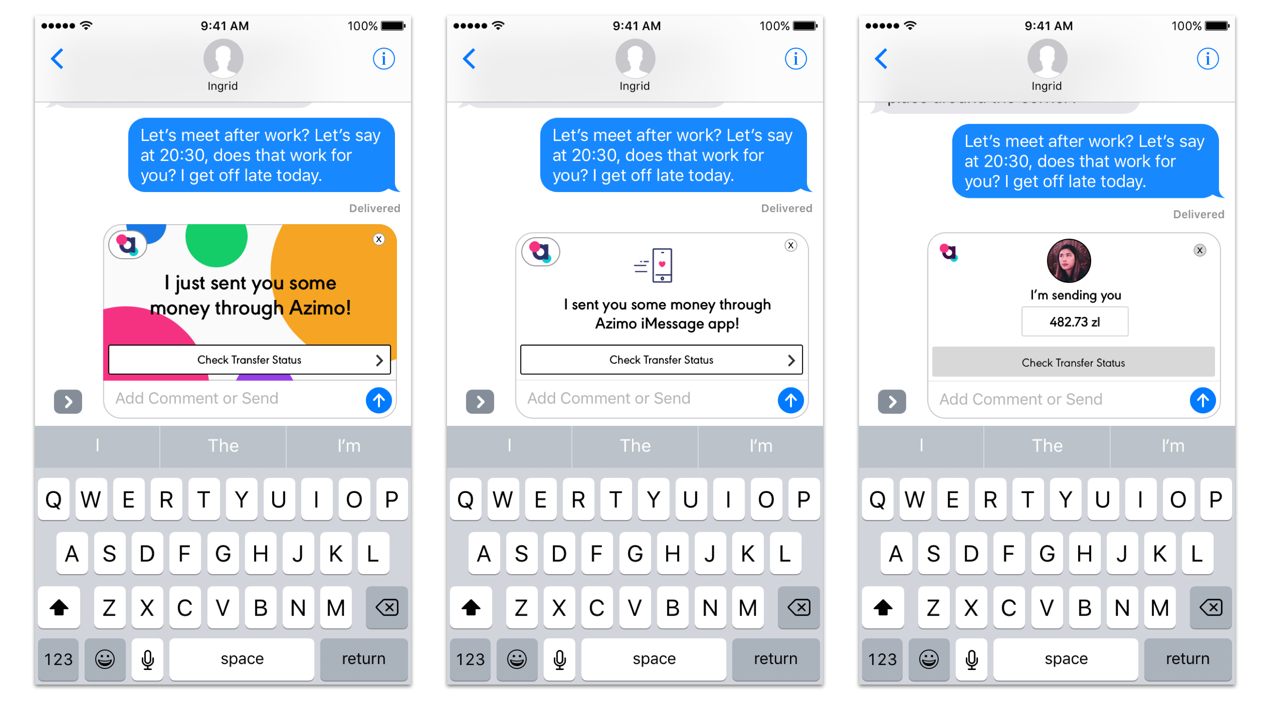
The last step is to send the money! Because iMessage only supports links, I created three options of enticing linked images that fit with the company branding. One has a picture of the sender’s face (to verify authenticity of the link), one uses iconography that fits with the brand, and one uses the colors and shapes of the brand. I made sure there were clear exit options (the x on the top right) and it was clear you had to click it (via the arrow on the first and middle option).
If I had time for future iterations, I would like to cut down on the number of screens. For example, if the user is logged in, the first screen after that would just be to the enter an amount to be sent. Furthermore, the option to do card setup and login within the iMessage app instead of being redirected to open the actual app since it was quite jarring and sometimes confusing to the users to leave iMessage then come back.
Azimo's iMessage app is currently launched! Download the app to try it out.(You have to have your card and account set up though 😉)
Working with on this project with Azimo has taught me to build fast so the product can be tested quickly, especially in this small, fast paced startup environment.
I'm happy to be able to have contributed to many aspects of the product team as well had the opportunity to work in London! Thank you to everyone across the pond.
Back to topAzimo had completely rebranded their app and I was tasked with one of the four tabs on the main screen - the Invite Friend page. The screen, despite it's simplicity, is an crucial path for the company to gain more users and thus more customers. The initial design (the one on the left) was the old design that did not work with their new branding anymore. The final design that I worked on is the on the right in which you can now see on the app store, live!
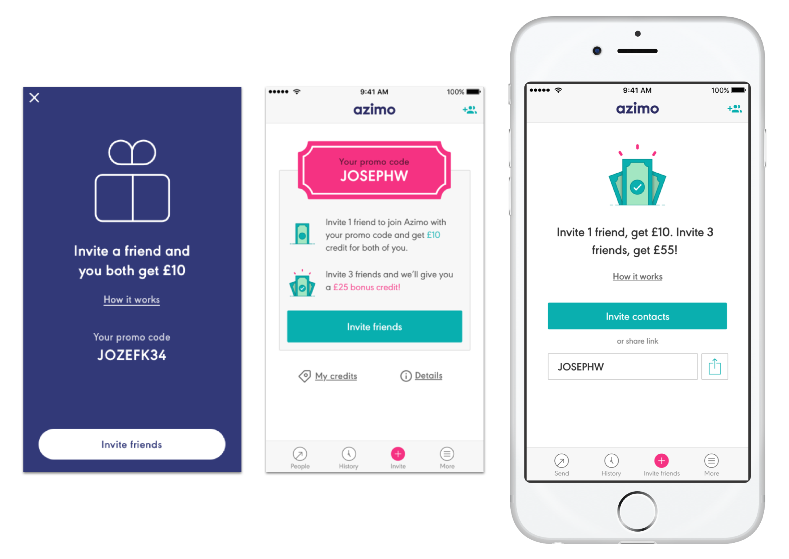
Azimo has this rewards program in which the more people you invite, the more money you will get - but the problem was how to represent this in a way that will convey the message to users quickly and effectively? Through iteration and feedback sessions, I used iconography, copy, and layout that was simple enough for users to understand at a glance and letting the action items (the buttons) be more obvious.
One challenge of this project was to make sure the main text was short enough so when translated into languages with more characters (ie. German), there would be enough space on the screen to do so.
On my downtime I also worked with the Branding/Visual Design team on redesigning the website country landing pages. The parts I was specifically tasked with were the delivery methods and testimonials. This is the old design and some things the team wanted to change.
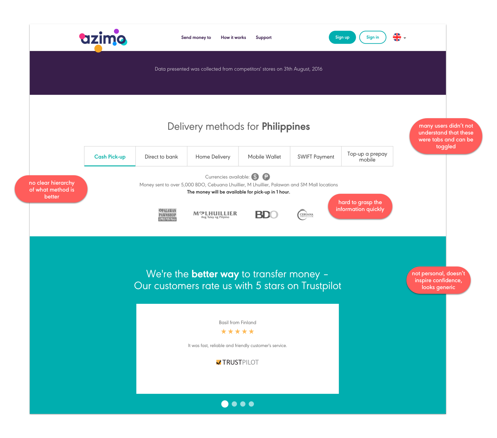
I used the brand’s shapes and colors to brainstorm what alternative designs could be used for this section. I drew inspiration from how subscription product pages priced their plans (ie. Spotify) and made sure to keep in mind the ability to scale (add more options) if needed.
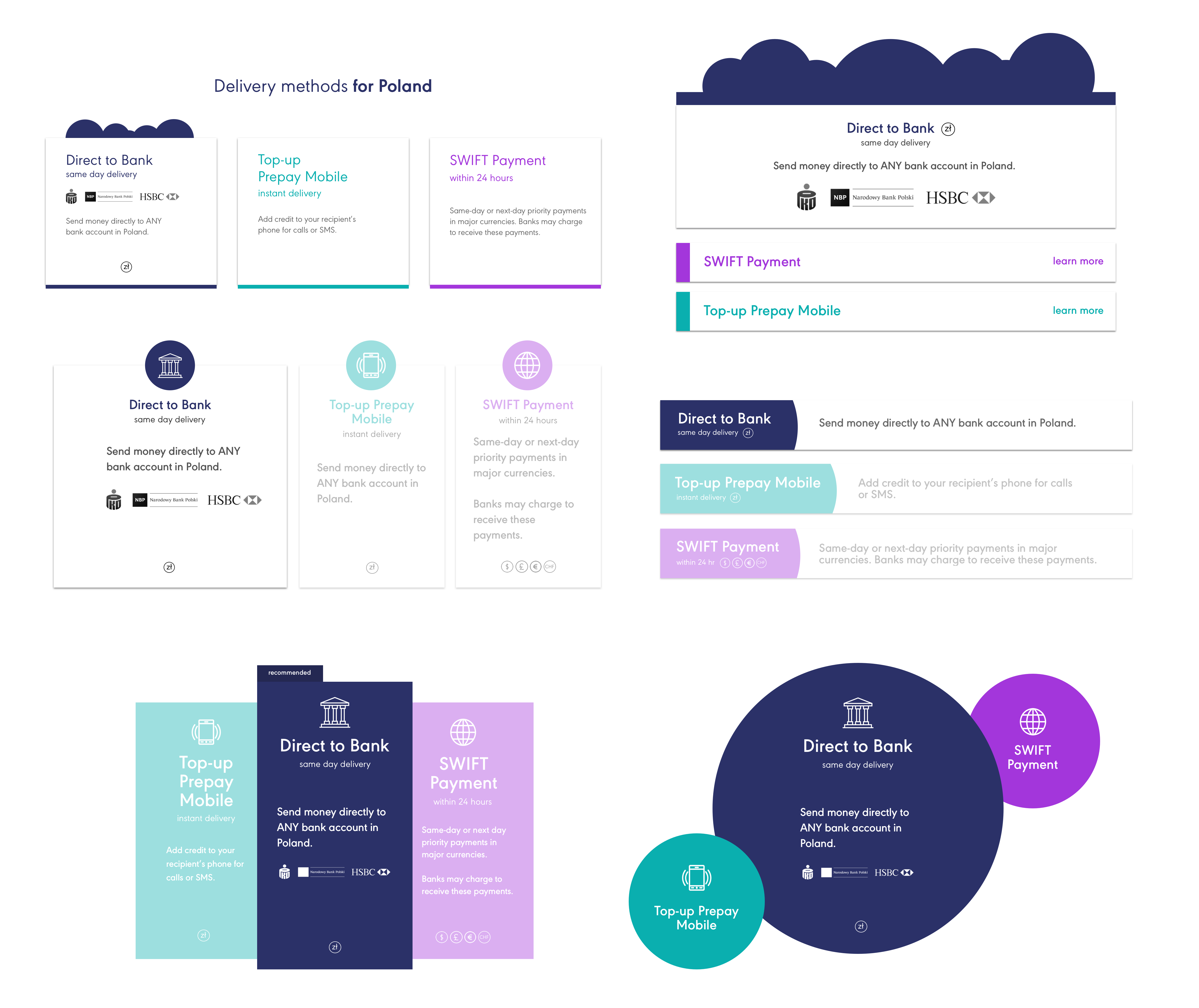
Something I would change would not to have some methods grayed out because it looked like those were not viable. I imagined it would restore to full opacity on hover but it might be confusing to the user.
The problem here was that the testimonials not personable enough despite being quotes from actual people.
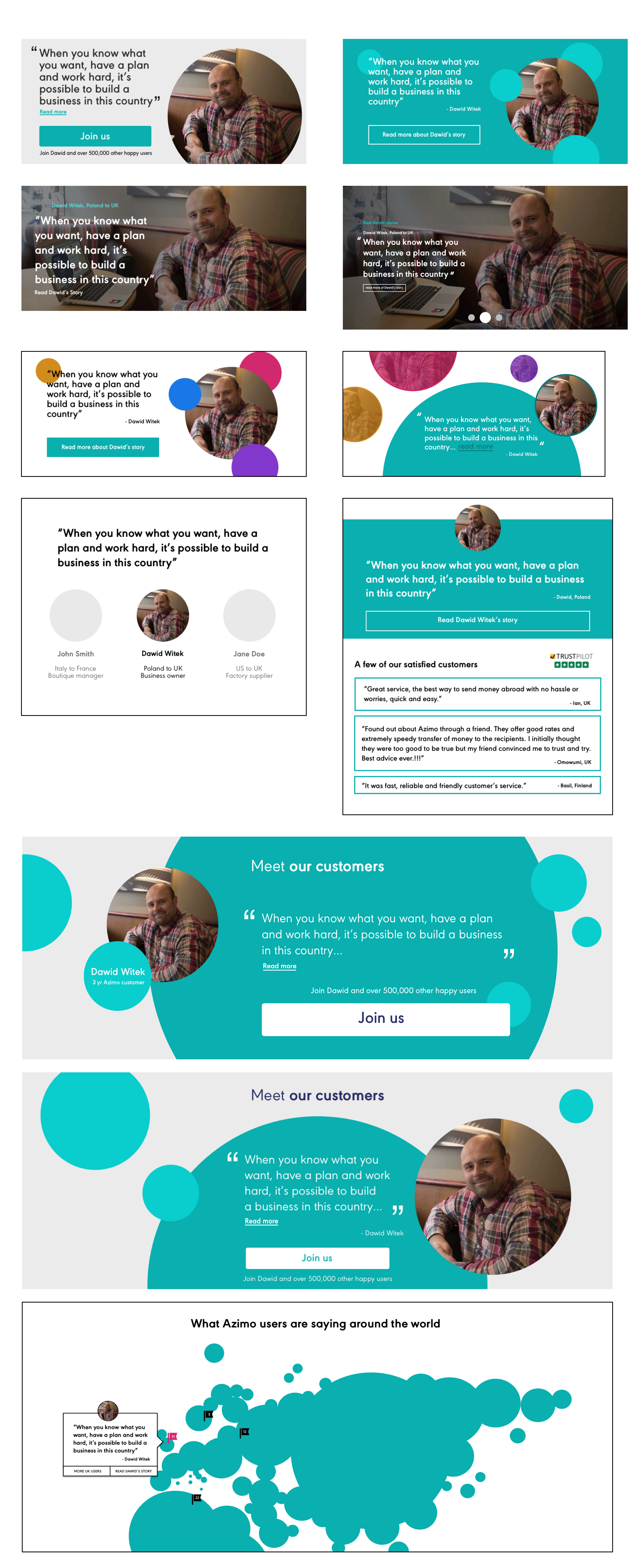
The top left one is the first iteration and then it went from there. Since the image wasn’t super high quality (and there was no guarantee future pictures would be), I wanted to include his face but not put too much emphasis on it. Putting a face and name to each review would greatly increase the authenticity of the review. I also played around again with the company's branding styles as well as designed possibilities to scale the feature if needed.
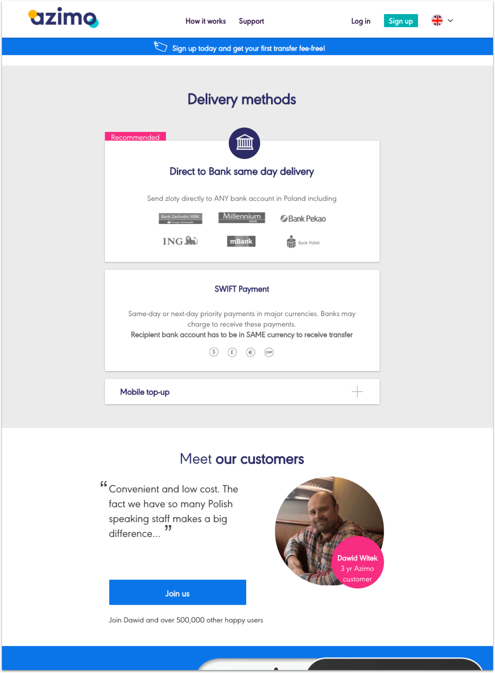
Since I wasn’t formally on the brand/marketing team, they had final decision on what elements of mine they ultimately built and launched. This is the current website screenshot I took as of March 2017. I do believe the redesign is the right step towards making the site more personable as well as easier to understand and use.
Back to top